|
|
Spotlight on Photos and Resumes
Does Your Photo Click or Make Them Shudder?
February 13, 2006
By Gerald Raymond
"Who am I anyway? Am I my résumé? That
is a picture of a person I don't know."
Those well-known lines from A Chorus Line may have
become a cliché over time, but what actor hasn't experienced
the painful reality of submitting a picture and résumé and
not knowing how someone would react? We showed four professionals
in the industry -- three casting directors and an agent
-- pictures and résumés that you submitted to Back Stage
and asked them to give us their quick first impressions.
On this occasion we talked to Erica Jensen, Stacy Baer,
Todd Thaler, and Arnold Mungioli. Jensen is a casting associate
at James Calleri Casting, which casts films, television,
and theatre; she currently works on the ABC series Hope
& Faith. Baer is an agent with Leading Artists Agency,
a boutique-size firm, and she represents mostly theatre-trained
actors for film, television, and theatre. Thaler, of Todd
Thaler Casting, casts film and television, working mostly
on independent, low-budget projects based in New York; he
recently completed work on a studio production, Perfect
Stranger, starring Bruce Willis and Halle Berry. Mungioli
has been in the business for 27 years and has worked as
the head of casting for both Livent and Disney Theatrical
Productions. He has run his own company, Mungioli Theatricals,
for the past five years and casts primarily theatre but
also television and film. His current projects include casting
for the Actors Theatre of Louisville, a new (as yet untitled)
Richard Maltby, Jr. musical, an avant-garde project for
P.S. 122 titled Hell, and the ongoing show Jewtopia,
which is shortly going into its fourth company.
Here's Looking at You, Kid
Here's what our panel has to say about your individual headshots
and résumés. Bear in mind, these are quick impressions and
purely subjective. You might find diametrically opposed
responses to the same photo. As Thaler points out, "One
man's ceiling is another man's floor" when it comes to looking
at actors' photos. "Any headshot you pick or someone recommends,"
he adds, "means there's a 50-50 chance that it will be disliked."
Mungioli explains, "We're all hired for our individual taste.
That's why there are more than one of us that a producer
can choose from."
Wendy Lane Bailey
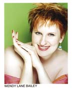
Jensen: This is an example of color to the extreme.
There's something comical about that green background. She
has that wonderful red hair, though, and I understand the
choice of color. But it looks like a print ad. And the dress
is too low-cut.
Baer: You know what, if she's a wacky broad, then
it's not a bad picture. Well, she's a cabaret singer and
she wouldn't be coming into my office. She's a redhead,
and I don't want to take away from that, but a black-and-white
version of this may seem less cabaret and less over-the-top.
Thaler: I think it's a little overproduced -- green
background, blue earring, and that pink thing off the shoulders
and a lot of skin. Maybe if it was in black and white, I
might think completely differently.
Mungioli: The hands, though they are lovely -- she
may very well be a hand model -- do not work for me in a
headshot. The earrings are fabulous. This headshot makes
me want to find out where she got them and buy a pair as
a gift for someone, but it doesn't make me want to hire
her as an actress.
This is a singer's résumé and that's totally fine, as long
as she's putting herself out there as what she truly is
and she gets work in what she wants to do.
Jenna Esposito
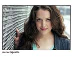
Jensen: I like this. It's clear and it doesn't look
overdone. In color shots you can always tell when someone
is wearing way too much makeup, but this is very nice. The
background's not distracting.
She has good credits and she's structured this nicely. I
appreciate that she has her children's-theatre credits and
cabaret credits separately and not mixed up with the others.
Baer: The color looks okay, maybe a little over-made-up,
but that's all right. The background is not overwhelming.
She has a lot on [her résumé]. She could take out almost
all the cabaret and the children's theatre.
Thaler: I'm old school in that I still like black
and white, but I don't discount a picture that's done in
color at all. I like the natural background. I actually
prefer repose to the smile, but in this one I'm curious
to know something else about her from this picture.
Mungioli: The biggest mistake of this picture for
me is not that it's in color, but that she's standing next
to some prison gate, or has her hand in some telephone wire
box that's extremely distracting. I'm very interested in
the spiral wires and not at all interested in the face.
[On her résumé] she avoids the height and weight issue altogether,
which in many cases will not do her a disservice, but in
many cases it will. So she separates out children's theatre
and cabaret, which makes me think that those are things
she does a lot of and wants to do a lot of, which is fine.
I see a lack of consistency in the presentation.
Sri Gordon

Jensen: Something about the way this picture looks
indicates to me that she has some features that might serve
well in a color shot. Her eyes, for example, are very light
and pretty. But the thing is, the black-and-white shot has
told me that, so there's something really good about this.
Baer: I think that's a great shot. A lot of things
can come off the résumé -- a lot of this is school. It looks
like she's done some Off-Broadway, so she should either
have a separate category for school or take out half of
it.
Thaler: Either she has the most exquisite complexion
or the picture has been retouched. Or she's got too much
foundation and makeup and completely blotted out the slightest
imperfections in her face. A little freckle or mole or a
pockmark or a little scar -- those are the things that set
you apart from everyone else. If the photographer or the
retoucher takes all of that away, then I feel like I've
been cheated out of something.
Mungioli: I like the definition of this picture,
and how she comes on so boldly. Her eyes may in fact be
uneven, which is fine if it looks like her, but if that's
a trick of the lighting, then it's not serving her well.
But she's a beautiful girl and I think that comes across
quite nicely here. My eye goes to her head in her headshot
and that's the goal, so this is terrific.
She does have the four staples on her résumé, but the bottom
two didn't hit the page, so it could come easily detached.
In terms of format, it's very easy to read and to absorb
what she's done.
Mark P. Jackson
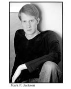
Jensen: It's an odd picture. The pose is strange;
it makes him look a little bit awkward. His expression is
blank and I'm not getting a whole lot from that. His résumé
is easy to read.
Baer: If he's going for intense redhead, it's not
a bad picture at all. The film credits on the résumé --
it's nebulous as to what a featured role is. If it's extra
work, take it off. If it was an actual role, just say "featured"
or "supporting." You don't have to mention the role that
you played unless it's a well-known film. He's starting
out, so this is good.
Thaler: He's got a great, interesting look. There's
something enigmatic, something that makes me want to put
it in my "to meet" folder. Color pictures have been a big
boon for redheads because you can never tell a redhead in
a black-and-white shot. I like that his résumé's got room
and air. Always leave some room to add something.
Mungioli: Oh, my God, no. I don't need to see the
big empty studio behind you. I don't need to see your knee
and your arm -- it's a headshot. He's in a totally defensive
position, with his arm covering his knee as a barrier between
me and him. I understand someone with hair that red and
eyes that blue wanting to use a color shot, but the pose
has taken away everything. If he went with the headshot
only, there's a handsome guy. I can get a sense of his body
type from the statistics and the fact that he has athletics
listed in his special skills, so he's wasted all of his
picture space because the information is already on the
résumé.
Vincent Victoria
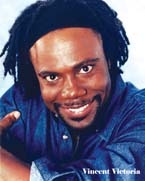
Jensen: This is really in-your-face and the color
is a little crazy and the quality is not great.
Baer: This is a little overdone, a little too color-saturated.
The résumé is fine, but there are a couple of things to
take off, like the dinner theatre credits.
Thaler: It's a bit intense, a little too much shine,
and it doesn't feel as professionally produced as it could
be. It's just hard to get a sense of who the guy is. I'm
sure there's so much more to him than what I see in this
picture.
Mungioli: This is very bold; the color perhaps is
a bit too much. I don't know if he's so vibrant when he
actually walks in the room. It does come on very strong,
but the face is strong and appealing and I actually like
it. The thumb coming all the way around to connect with
the shoulder -- that does bother me.
In his theatre credits, my eye goes right to the space next
to How Anansi Came to America; he's got to figure
out how to list that better.
Mia Anderson
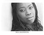
Jensen: I don't really like the way the picture is
cropped. Her résumé is structured well, easy to read, and
highlights her strength, which is theatre.
Baer: It's a good headshot if what she's interested
in doing is edgy work, but it cuts off a bit of her head.
There's too much on the résumé and very little here that
I can sell.
Thaler: I would say that it feels soulful. It seems
out of doors and uses natural light. I like it. I've gotten
used to the fact that there's no longer a standard, so I'm
just as likely to like a picture that's horizontal as vertical.
The résumé is readable: You should lead with your strong
suit, so she has theatre on top.
Mungioli: Well, she looks unhappy. She has a beautiful
face, but for some reason this picture de-emphasizes her
eyes. She has beautiful hair; I don't understand why she's
flattened against the wall.
The résumé is done in standard format, which is terrific.
Under "Cabaret," where she lists this show with herself
as director, producer, performer, and all the cities it's
been done in, visually [it] creates a large white space,
giving it too much focus in a way I think she doesn't want
it to have. The same thing under "Education" -- the justification
has to make sense and make it easier and not harder to read.
Corie Berkemeyer
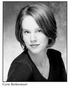
Jensen: My personal taste is that there's something
a little flat about it. I don't know that it would jump
out at me if I was going through the mail, but this is a
perfectly presentable shot. Her résumé is readable and structured
well, but it should be cut down to the size of her photo
and stapled, not clipped.
Baer: The background is somewhat corporate-looking
but it's not a bad picture, just a bit old-fashioned. The
résumé is actually pretty good. I'd put her film and television
credits first because she was a guest star on Dawson's
Creek, which is a pretty good credit.
Thaler: It feels a little bit generic, not [as] distinct
or unique as it could be. She seems to be a very cute girl.
The résumé should definitely be stapled. I don't think it
should be the responsibility of the person you send it to,
especially if the front of your photograph doesn't have
any contact information.
Mungioli: The picture is okay. She's in an odd position
and her shoulders are doing kind of a funny thing that's
a little bit off-putting. And I wonder if, when she walks
in a room, her hair will be in exactly this style or if
this was styled for the picture, which is something that
actors often do.
I don't know what "guest Wendy Wasserstein" means next to
her Uncommon Women credit. Was she a guest who came
and saw the show, or was she the director? We already know
she wrote it. I don't know the program at Meredith College,
so I'd like to see more about her training. I don't need
every class she did in four years, but it feels sketchy.
Joe Caruso
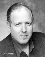
Jensen: This is totally fine, but like everything
in the world, even headshots become dated. I do think actors
should be concerned about that. This is not really eye-catching.
Now, if I'm looking specifically for his type, I would certainly
turn it over and investigate further, but otherwise I might
not.
He's got some really interesting skills listed: pantomime,
commedia dell'arte, vaudeville -- that's specific. If I
was doing a project that needed it, that would be fantastic.
Baer: It's just an old-fashioned style, but if it
looks like him, that's fine. I don't know whether Models
on the Move is a temp agency or management, but a proper
letterhead will be better than this little print at the
top. "Principal" and "Featured" under television credits
is nebulous to me. If you're an extra, unless you have nothing
else on your résumé, don't put it on.
Thaler: I'm always a little concerned with the sports
jacket -- it has a formality that I think doesn't do actors
a tremendous service. But I like that he's got an interesting
look.
Mungioli: Well, the headshot is okay if it looks
like him. What is very noticeable to me is that he's not
smiling. This is an introduction and it's not as warm as
I would guess he would be capable of being.
"Age range" is a mistake. You're not the age you are, you're
the age you play, and we should be able to tell from your
picture and résumé. "Voice: character" is superfluous and
not useful. "Stage: List on Request" is confusing to me.
Since we have a fair amount of summer theatre and dinner
theatre, what would the additional credits be?
Saida Cooper
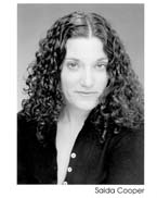
Jensen: It's perfectly acceptable. Maybe a few areas
around her face could use touching up.
Baer: I get a specific feeling about her personality
looking at this picture, but I don't know if it's really
this person or not. She can take out some of her college
credits. She's the kind of person who should send her picture
to Law & Order and see if there's a small role
for her.
Thaler: I'm a big fan of repose in a headshot, where
there's a neutral, almost expressionless look. This has
a slightest bit of a smirk or some kind of attitude, which
I think is limiting. Sometimes it's the photographer's fault.
I prefer that the shutter be snapped before you react to
something.
Mungioli: Saida doesn't look happy. She has great
hair, but it looks a little bit in her face on the right-hand
side of the picture. The large portion of unbuttonedness
in what is a headshot feels unnecessarily suggestive.
Get the address off the résumé immediately. It feels like
it has a lot of space in the theatre credits, but ultimately
it's readable and that's my main concern, so I have no problem
with this.
Juliette Fairley
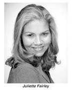
Jensen: I don't love this shot; it looks very dated.
Her hair is not falling right in certain places. I would
say this needs a do-over. But her résumé is fine.
Baer: I have no idea who she is from this picture.
She needs a new headshot; it's not flattering. Her résumé
is fine, but she can take out the commercials.
Thaler: I'm not a big fan of this picture because
it has a little too much behavior. It's very studio, looking
over the one shoulder. It feels like what the photographer
does at high school graduation.
Mungioli: This picture is not showing her off in
a particularly positive way. She has her shoulder at me
and it feels, as the expression goes, a cold shoulder. It's
a nice face, but the picture puts her hair at a strange
angle because her neck is at a strange angle. For an actor,
it's a great thing to have long hair, but in a picture it
has to look less going in every direction.
The [résumé] format is right, but her left-justified columns
are all over the place, which makes my eyes go back and
forth. In "Theatre," it's confusing, because she has theatres
listed, but in the last credit she says San Antonio, Texas,
but doesn't tell us where it was done. In "Training," she
puts the Columbia University graduate program at the very
bottom of the list. I'm guessing that means she never graduated
or only took a course there. Things like this tend to tip
off more about what a person hasn't done than what they
have done.
Jaclyn Friedlander

Jensen: I think this is a really decent black-and-white
shot -- it's active and it's got variations. If I were to
be really picky about it, I might suggest lightening the
area behind her head so you can tell where the hair ends.
If you're going to put another picture of yourself on the
résumé, you might want to consider a picture wearing something
different or showing a different kind of look. It doesn't
bother me personally. Sometimes it can even help me.
Baer: It's a fine picture and the quality is good.
[The other photo] on the résumé might be a better picture
for her. The résumé is fine, but National Choir Festival
is something that she can take off.
Thaler: As a rule, I'm not a fan of the smile, but,
funnily, I think she is very much like this picture, and
I like that it's out of doors. The photo on the résumé --
it's the solution to the composite picture, which I think
most of us hate. But how do you make the decision to put
one image on the back and the other on the front? I think
you're generally better off putting out one thing.
Mungioli: There's a lot of scenery, which I don't
like. Here we have an 8-by-10 piece of paper, which is 80
square inches to work from, and the size of the actual headshot
is 4-by-2, 8 square inches. That tells me something about
what you think of your face.
The sizes of the theatres listed are all over the place.
I understand she was trying to fit it all in, but you have
to find another way to do it. She also needs to rethink
the "Training" listing -- it's not clear or easy to absorb.
Edward Furs

Jensen: I like this; it's very straightforward. He
looks like he has something going on, and I like the composition.
The type is really small -- he has a lot of credits. He
may want to consider taking the voiceover section off and
have a couple of résumés for different things. I don't really
understand Pepsico Summerfare -- it needs to be clear or
needs to be taken off.
Baer: That's a perfectly nice picture for him. His
résumé is a little bulky. I don't think he needs the voiceovers.
He needs to take off some other stuff that's old as well.
Thaler: I remember him from when he did extra work,
and he's always had that mustache. I wonder what he'd look
like without the mustache. I would imagine that even if
you were more than willing to shave it off, you'd probably
be discounted because you sent a photo with a mustache.
If he prefers himself with a mustache, then at least for
photo day he might consider taking some shots without it
and growing it back immediately thereafter. But it's a good
shot and I quite like it.
Mungioli: I know him and that looks like him, which
is a big plus. A very crowded résumé. I would like slightly
larger print. For consistency, if we have CBS TV listed,
we'll need to have the film company on the other credits
and not just the directors. Voiceovers to me could be taken
out or listed as "upon request," and that would give me
more room to make this more readable. With the number of
roles he's played at this point, I don't need him to list
every class he's taken. Voice and dialect, acting and soap
acting can be categorized together.
Florence Galperin
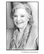
Jensen: This is really light, kind of washed out.
Her eyes look bright and engaged and she has a nice smile.
Her résumé is great; it's nice and big. But she may want
to narrow down the credits in some areas.
Baer: If the picture could be a little sharper, it
would be nice. She's obviously been working for a while
and she can take some things off the résumé. Stand-in work
is not necessary.
Thaler: It looks a little fuzzy. I don't know if
it's been retouched to reduce the character in the face,
and I generally don't think that's a plus. She lists stand-in
work on her film credits and that's basically working as
a crew person more than as an actor.
Mungioli: I like that she's smiling and that she
looks lovely. I'm getting a bit more of the scarf than her
face. If you put your hand over the bottom three inches
of this headshot, it's much lovelier and my focus goes to
her face.
I would take off "age range." I get that she's an older
woman, and you are the age you play. It jumps out at me
that Henry V is indented and I don't know why, but
everything else lines up pretty nicely. She indicates that
Sophie's Dresses is a musical, which makes sense
in that it's not a known musical name.
Charlotte Geijer

Jensen: You can see the reflection in her eyes. Is
that the photographer? At first I was "I really like this,"
but now I'm starting to see some areas where the details
of her face may have been airbrushed a little too much.
I like to see people's personalities come out in their face.
You don't want to look like a mannequin.
She has her training on the top, which indicates to me that
she's a young actor starting out. She does have some theatre
and film credits, so my advice would be to put the training
on the bottom.
Baer: That's a great headshot. It's good that she's
mentioned she's a commercial model. It will make up for
the fact that she hasn't got much on her résumé. It's fine
that she starts with the training because that counters
the fact that she was a model.
Thaler: I would hope she's as attractive in real
life as this picture depicts her to be. There's always the
hazard that when you come in, the person looks at you and
then at the picture and looks at you and then back at the
picture. I may call Charlotte and say, "Are you in Manhattan
and can you be here in 20 minutes?" If she needs two hours
to look like this, then her answer would have to be no.
But if she just threw a sweatshirt on and jumped on the
subway and could look this good, God bless her!
Mungioli: It shows I'm out here to play the pretty
thing. That's okay if that's what I'm casting, but then
don't bother me if you're not taken seriously for other
types of acting roles. Early on in my teaching, I would
tell people: If training is what you have, then put that
first. But I think the industry has changed and the truth
of the matter is, if your credits are weak and your training
is strong, we will see that. So I do think it's necessary
for your credits to be first. It's not okay to say "lead"
for plays like Miss Julie or In the Boom Boom
Room, because these are well-known titles, and I'm interested
in knowing the roles that you played. Commercial model is
useful, I think, because it confirms the look you see in
the picture.
Andrew Goffman
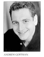
Jensen: This is nice. He's got some personality around
the eyes and something about his face gives me the impression
that he's got a nice sense of humor. It's a little bit light
maybe -- we could do with more details. Overall, something
about it speaks to me. And when you look at his résumé,
yes, he's a standup comedian.
Baer: The smile is a little forced, but it's fine.
This is a perfectly fine résumé, but I think he can take
out New York News, which is an old television show
that didn't run very long. He's a comedian; that's interesting.
Special skills, yes, you should put down anything specific
that you're really good at, because it can be really helpful.
Thaler: It feels a bit generic, and the smile --
it's almost a little self-conscious. It seems almost like
it's hurting him to hold the smile. He's a standup comedian,
so, if anything, you'd want that smile to be more genuine.
It may have been sincere, but to me it didn't come off as
one.
Mungioli: The picture is a little bit yellowed and
the résumé should be cut to size. I'm glad that he's smiling,
but it looks an odd position or angle. He emphasizes that
he has standup comedy and that's very useful because there
are many roles where creative team members will say that
it's a plus or that's the sensibility that they want. And
he's done a good amount of it, and that's what makes the
difference. "Theatre": In the first credit he says who directed
him but not where it was done. In the second credit he has
where it was done but not who directed it -- that can be
confusing.
See more headshots and resumes in Part II of our "Spotlight"
series, coming to BackStage.com on Wednesday.
|
|
|
